Why are the first 3 seconds of a user’s interaction with your website crucial?

The growing e-commerce industry
In psychology, there’s a well-known concept called the Halo effect. It describes our tendency to attribute positive traits to people who make a good first impression. Simply put, you’d be much more likely to hand over a couple of bucks to a man outside a store if he happened to be wearing a suit.
Research shows that it takes users just 50 milliseconds to form a first impression of a website. This can be a bit intimidating if you’re about to launch a new, niche store selling used covers for materos (those cups for yerba mate- herbal brew). However, by knowing exactly what users will see, we can guide them along the right path.
The most suitable path is the one users are already familiar with. So, we place the logo on the left and add a navigation menu, maybe an icon or two. Below that, we pack the most important information in a slider or a huge banner, and we’re done. Thank you, see you next time.
Actually, not entirely…. Because the devil is in the details.
Header
Let’s go through some examples.

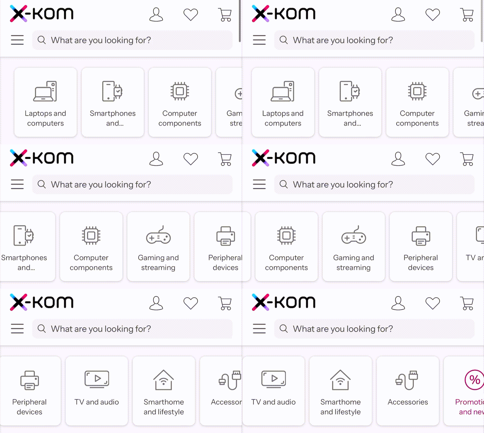
The first thing that stands out is the large search bar. You might think it’s not that important, but when designing a store, it’s essential to realize that users are coming to find something specific. It’s crucial that right after the page loads, they can immediately jump to the items that interest them.
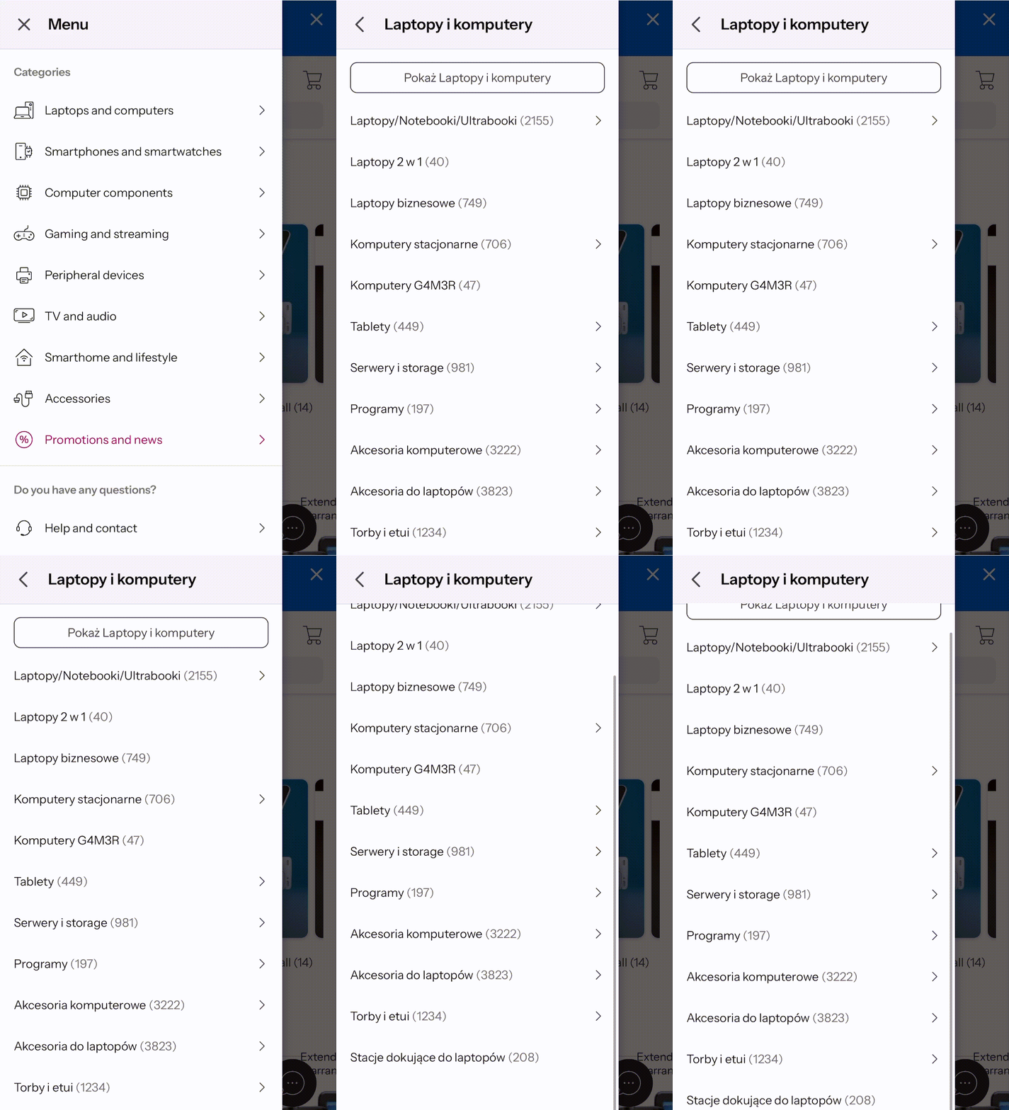
Another effective tactic is creating a separate category for discounted products. To encourage shoppers to browse our selection, we must offer them a good deal—ideally highlighted in red.
A crucial detail worth noting is in the mobile menu: if a link also serves as a button to open a submenu, it should never navigate to another page. There’s nothing more frustrating than trying to open a menu and accidentally hitting an arrow, only to be redirected somewhere unexpected.
The last element that defines a good header is something I rarely see but, according to research, makes a big difference: a link to customer support. On X-kom, right next to the search bar, there’s an icon inviting users to “Help and Contact.” This gives the impression that the store aims not just to make a one-time sale of some gadget from AliExpress and vanish, but rather to build a lasting, trustworthy brand.
Slider
It’s easy to imagine the initial excitement of amateur web developers a decade ago when they managed to transform dull, text-based pages into animated masterpieces. Unfortunately, the slider is to a website what professional printing is to realistic painting. Now, even your aunt can have the Mona Lisa hanging in the hallway between the kitchen and the bathroom. It sort of takes away the awe, doesn’t it?
It turns out that only 1% of users click on a link in a slider (and that’s just the first one). By the time it reaches the third slide, no one is clicking anymore. This is for a simple reason: no one is even seeing it.
Carousels have never truly met their intended purpose. It’s no wonder you won’t see them on major e-store. They don’t work well with SEO, slow down page load times, and worsen site navigation, all while “hiding” information that could be crucial to users.
If you’re interested in this topic and want to learn more (or just have a laugh), check out the article Sliders Suck and Should Be Banned from Your Website.
Banner/Hero Image
The banner/hero image is by far the most challenging part. It needs to make an impression on the user—and, even more difficult, a positive one.
For online stores, it’s important to avoid displaying regular products at standard prices. Looking at the biggest online retailers, you’ll quickly notice that their banners are usually not that large—or sometimes nonexistent.
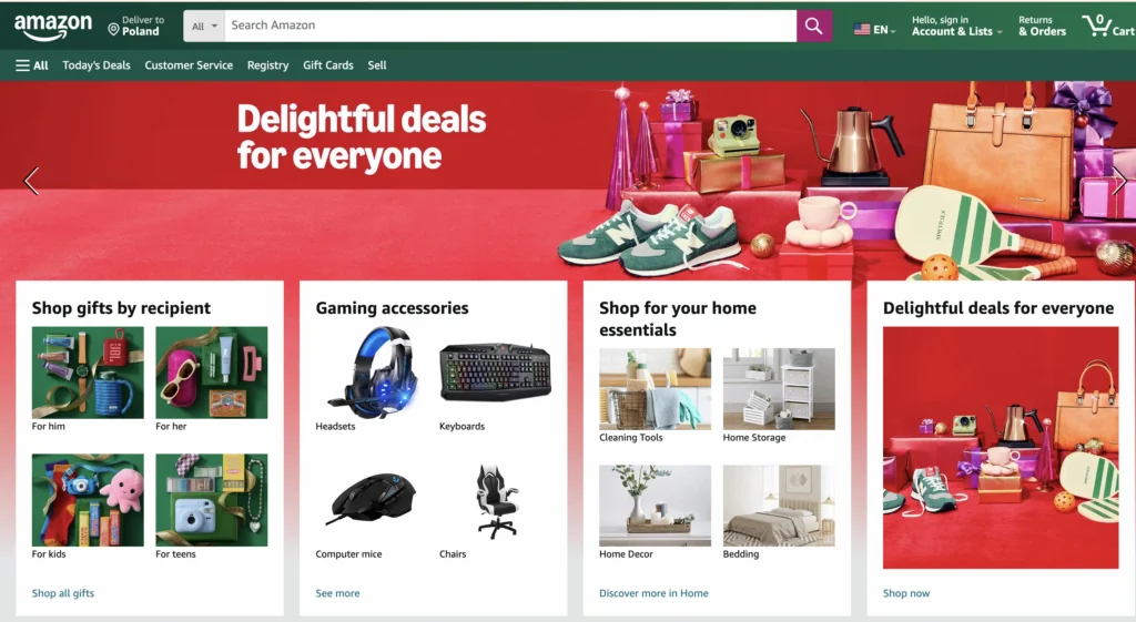
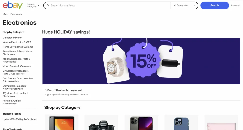
Sometimes, non-existence seems like a good option—and I’m not just talking about Monday mornings. When analyzing industry studies, we often come across the concept of banner blindness.
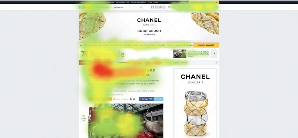
Years of regular internet browsing have trained us to ignore ads—an ability that only improves the more visible an ad is. So, when designing a banner, focusing on product categories or sales is best.
But what if nothing’s actually selling?
If nothing’s selling, sticking to the basics works best. If the first thing a user sees is some well-crafted text, a fitting image, and a clear call-to-action button, we should be in good shape.
The most important thing, however, is to maintain what’s called the F-shape for our content. This means that key information should appear on the left side. It’s no coincidence that in every movie with big battles, the “good guys” always attack from the left. This comes from a strong cultural association. It’s essential to keep this in mind even in details like page layout.
The second important, yet somewhat counterintuitive, factor is the font size. Users tend to skim more as the text gets larger. This means that with a sufficiently large font, we can retain text in the banner without drawing too much focus.
(Excerpt from the lyrics “Don’t Let Me Down” – The Chainsmokers ft. Daya)
“I need ya, I need ya, I need you right now
Yeah, I need you right now
So don’t let me, don’t let me, don’t let me down”
And probably, no one will even notice.
Web Accessibility
Accessibility cannot be overlooked when discussing the creation of a positive first impression on a website. If a site is not accessible to all users, we risk losing a portion of visitors immediately.
For some individuals, the keyboard is the primary tool for navigating a website. If keyboard navigation doesn’t work correctly or the user gets stuck in a so-called “keyboard trap,” frustration will quickly lead them to close the browser window.
The same applies to contrast. If text is difficult to read against the background or key interface elements blend into their surroundings, users with visual impairments may be unable to use the site at all. Poor accessibility results in losing users and leaves an impression of unprofessionalism and a lack of care for customers.
If you want to learn more about web accessibility, read our article dedicated entirely to this topic: Why does web accessibility matter?
Summary
Creating a strong first impression in just a few seconds is essential in the competitive e-commerce world. From optimizing headers to crafting meaningful banners, each detail can influence how users perceive and interact with a website. Prioritizing elements like a prominent search bar, dedicated sections for discounts, and accessible customer support links can enhance usability and build trust. Avoiding distractions such as sliders and minimizing banner sizes helps maintain focus. By following familiar layouts and keeping key information on the left, websites can improve navigation and appeal, leading to an intuitive and engaging user experience.
